 Joan León
 Pixel art is a form of digital art created through a computer using raster graphics editing programs, where images are edited at the pixel level. - Wikipedia
I’ve always liked pixel art, I’m fascinated that with so little information we can recognize objects and characters. Many people think that because it’s with “little squares” (aka pixels) it’s a very easy drawing technique, nothing could be further from the truth, I think the difficulty is proportional to the appearance of simplicity.
Motivation
Some time ago I wanted to play with pixel art, I think the best way to start something new is to copy be inspired by references that aren’t very complex. At the same time I wanted to do it with CSS, I always want to show that, even though it’s not a programming language (as our friend Carlos Villuendas always reminds us), you can do real wonders with it… I’ll dedicate a post to talk about < css-doodle /> 😊
In the Shadow of CSS
One of the CSS properties we’ve had available for a long time is box-shadow, widely used to highlight elements and give a sense of depth or relief.
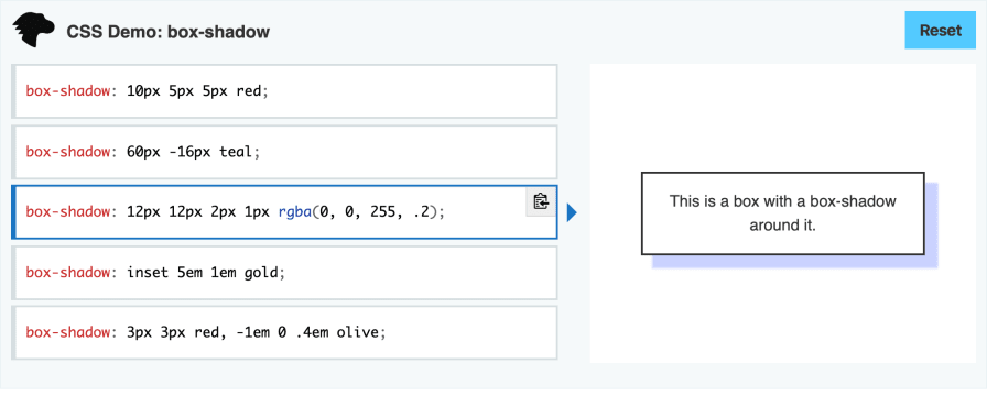
The box-shadow syntax has several options, I invite you to take a look at the documentation on MDN. If you have any questions, remember that I have an AMA (Ask Me Anything) repository where you can send me your questions.
Let’s focus on the syntax that will allow us to create pixelated art.
If we look at the property definition, it tells us:
The CSS box-shadow property adds shadow effects around an element’s frame. You can set multiple effects separated by commas. A box shadow is described by X and Y offsets relative to the element, blur and spread radius, and color.
The part that interests us most is You can set multiple effects separated by commas. This will allow us to define each of the pixels of our character.
In our HTML file we only need one HTML element with a class to apply the CSS magic.
<!DOCTYPE html>
<html lang="en">
  <head>
    <meta charset="UTF-8" />
    <meta name="viewport" content="width=device-width, initial-scale=1.0" />
    <meta http-equiv="X-UA-Compatible" content="ie=edge" />
    <title>CSS Pixel Art</title>
    <link rel="stylesheet" href="styles.css" />
  </head>
  <body>
    <div class="pixel-art"></div>
  </body>
</html>
Now let’s add the necessary CSS to paint some pixels.
.pixel-art {
  width: 1px;
  height: 1px;
  margin: 50px;
  transform: scale(20);
  box-shadow: 1px 0 red, 2px 0 green, 3px 0 blue;
}
Let’s analyze this code line by line
- Since we’re going to work at the pixel level, the first thing we do is define a size of 1px x 1px for our HTML element.
- With the margin property, we’re simply positioning it 50px from the 0,0 coordinate of the body.
- This property is important, when painting at pixel size, we scale the element to be able to display it at a more appropriate size, in this case we’re scaling the element 20 times.
- Finally, we define the property that gives us the magic to create our pixel art work.
Let’s see it in action
What we can see are three (sad) pixels, one next to the other 😅. But with just this simple example I’m sure you already see the “simplicity” of what we have to do to draw our pixel drawings.
Let’s create another more illustrative example.
In this other example you can see that the element size is 4px and the scale multiplier is 5 with scale(5), we’ll see the reason later 😊. What’s interesting is that with a few shadow values in our CSS we’ve achieved a Pixel Art version of the blog logo.
At Pixel Level
If we analyze up close (at pixel level) any pixel art work, we can see that it’s a matrix of pixels, where each of those pixels has the information of the color it’s represented with.
The previous image would look like this in a matrix where we’re defining the hexadecimal color of each of the pixels. We omit the “padding” pixels we’ve left to improve image readability, so we’ll have a 10 x 10 matrix.
#000000,#000000,#000000,#000000,#00b0b0,#00b0b0,#000000,#000000,#000000,#000000,
#000000,#000000,#000000,#00b0b0,#00b0b0,#00b0b0,#00b0b0,#000000,#000000,#000000,
#000000,#000000,#000000,#00b0b0,#f0d0d0,#f0d0d0,#00b0b0,#000000,#000000,#000000,
#f0d0d0,#000000,#000000,#000000,#f0d0d0,#f0d0d0,#000000,#000000,#000000,#f0d0d0,
#f0d0d0,#f0d0d0,#f0d0d0,#f0d0d0,#4040e0,#4040e0,#f0d0d0,#f0d0d0,#f0d0d0,#f0d0d0,
#000000,#000000,#000000,#000000,#4040e0,#4040e0,#000000,#000000,#000000,#000000,
#000000,#000000,#000000,#000000,#4040e0,#4040e0,#000000,#000000,#000000,#000000,
#000000,#000000,#000000,#4040e0,#4040e0,#4040e0,#4040e0,#000000,#000000,#000000,
#000000,#000000,#000000,#4040e0,#000000,#000000,#4040e0,#000000,#000000,#000000,
#000000,#000000,#f0d0d0,#f0d0d0,#000000,#000000,#f0d0d0,#f0d0d0,#000000,#000000;
Like cross-stitch, we simply define a color for each of the points we want to paint.
Supercharged CSS
As you might be imagining, achieving more complex drawings can take us a lot of work, and that’s true. That’s why we’re going to rely on Sass to facilitate the generation of our pixel art creations.
Let’s analyze step by step what we’re doing
We define in variables the different colors we need to create our drawing. We also define a variable with the grid dimension.
$hair: #00b0b0;
$skin: #f0d0d0;
$clothes: #4040e0;
$grid: 10;
Then, we use a Sass Maps to be able to use the map index keys, this will make it easier for us to create the matrix.
$colors: (
  1: $hair,
  2: $skin,
  3: $clothes,
);
The next step is to define the matrix with the colors of our drawing. We’ll do it with each of the keys from the Maps we just created, we’ll use 1 to reference the $hair variable, which in turn is the hexadecimal value #00b0b0, the hair color.
// Lemming Blocker -------------------
$lemming-blocker: 0, 0, 0, 0, 1, 1, 0, 0, 0, 0, 0, 0, 0, 1, 1, 1, 1, 0, 0, 0, 0,
  0, 0, 1, 2, 2, 1, 0, 0, 0, 2, 0, 0, 0, 2, 2, 0, 0, 0, 2, 2, 2, 2, 2, 3, 3, 2,
  2, 2, 2, 0, 0, 0, 0, 3, 3, 0, 0, 0, 0, 0, 0, 0, 0, 3, 3, 0, 0, 0, 0, 0, 0, 0,
  3, 3, 3, 3, 0, 0, 0, 0, 0, 0, 3, 0, 0, 3, 0, 0, 0, 0, 0, 2, 2, 0, 0, 2, 2, 0,
  0;
It’s hard to appreciate, but right now we have a 10 x 10 matrix just like the one we saw a bit above, with the red grid to see the pixels, with a numeric value for each of the colors. For Sass this is a list, so we can iterate over it. Technically it’s a single line, here we see it in grid mode to facilitate editing.
You’ll have seen that for the black color we’ve used the value 0, which we don’t have defined in our Maps, now we’ll see how we’re going to use it.
Let’s start with programming
Sass provides us, as they define, an extension language for CSS. It’s a CSS preprocessor with syntax that offers us functions, lists, maps or loops among others.
The following code contains the “magic” necessary to paint all the pixels needed to draw the lemming.
@function pixeart($lemming-list, $shadow-count: $grid) {
  $shadows: ();
  $row: 0;
  $col: 1;

  @for $i from 1 through length($lemming-list) {
    @if (nth($lemming-list, $i) > 0) {
      $shadows: append(
        $shadows,
        ($col * 1px) ($row * 1px) 0 map-get($colors, nth($lemming-list, $i)),
        "comma"
      );
    }

    @if ($i % $grid == 0) {
      $row: $row + 1;
      $col: 0;
    }

    $col: $col + 1;
  }

  @return $shadows;
}
Let’s analyze this Sass code
The pixelart function accepts two parameters, the first is a list and the second the grid dimension, where we define a default value in case we don’t receive one.
At the beginning of the function body we define an empty list with $shadow, as well as the initial value for rows and columns in $row and $col.
In the next block we have a @for to iterate each of the elements of the list (with our matrix) that we received as argument $leming-list.
In the first @if, where we check if we still have elements from the list, what we’re doing is adding an element to the @shadows list with append. We’re passing 3 parameters to append: the list to which we want to add the element, the element content and the separator, in this case 'comma', a Sass reserved word to represent the , character. Going into detail of the element value we’re adding we see ($col * 1px) ($row * 1px) 0 map-get($colors,nth($lemming-list,$i)).
- ($col * 1px), is the X position relative to the HTML element.
- ($row * 1px), is the Y position relative to the HTML element.
- 0, is the value indicating the shadow gradient, we want it to be a solid shadow.
- map-get($colors,nth($lemming-list,$i)), with the Sass
map-getfunction we’re getting the value from the color matrix according to position$iof our iteration.
In the second @if, we simply check if we’ve reached the maximum number of columns, 10 in this example, and if so we pass the column value to 0 and add one to the rows $row
Finally, we return the content of $shadows with @return $shadows.
Call from CSS
Now that we have our function available, we can use it in CSS with pixelart($lemming-blocker), as we can see on line 7.
.lemming--blocker {
  width: 1px;
  height: 1px;
  margin: 100px;
  transform: scale(10);

  box-shadow: pixelart($lemming-blocker);
}
Giving Life to Shadows
Now that we have our lemming in pixel art, let’s give it life thanks to CSS animation.
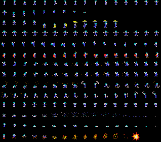
As you may know, an animation is the illusion of movement when viewing a sequence of images at a certain speed. This type of images in many 2D games are sprites, so I searched for Lemmings sprite animation and found this image. This allowed me to see the sequence of images to make the animation.
The lemming on the left has only 2 frames, so with two matrices we already have the animation solved.
.lemming--blocker {
  width: 1px;
  height: 1px;
  margin: 100px;

  transform: scale(10);

  animation: blocker 0.65s step-start infinite;
  box-shadow: lemming($lemming-blocker-1);
}

@keyframes blocker {
  50% {
    box-shadow: lemming($lemming-blocker-2);
  }
}
To achieve the walking effect of the lemming on the right, it requires 8 frames, so we have to define 8 matrices (take a look at the Codepen code).
Assigning the animation doesn’t have much mystery, we’ll do it just as we do in any CSS animation with @keyframes.
.lemming--walker {
  width: 1px;
  height: 1px;
  margin: 100px;

  transform: scale(10);

  animation: walker 0.65s step-start infinite;
  box-shadow: lemming($lemming-walker-1);
}

@keyframes walker {
  12% {
    box-shadow: lemming($lemming-walker-2);
  }
  25% {
    box-shadow: lemming($lemming-walker-3);
  }
  37% {
    box-shadow: lemming($lemming-walker-4);
  }
  50% {
    box-shadow: lemming($lemming-walker-5);
  }
  62% {
    box-shadow: lemming($lemming-walker-6);
  }
  75% {
    box-shadow: lemming($lemming-walker-7);
  }
  87% {
    box-shadow: lemming($lemming-walker-8);
  }
}
Matrix Is Not for Me
At this point you’re probably thinking: Having to make an n x n matrix of each image, and multiply it by the number of frames needed if I want to make an animation, seriously Joan, you’re crazy.
This type of exercise helps us practice and learn, but depending on what you want to do it’s clear that it’s a very tedious artisanal way of doing it. That’s why I’m sharing the following resource with you.
CSS Sprite Animator
It’s an application developed by Paul Karlik, you can find it here and the repository with the source code here.
It has an intuitive and simple interface. As soon as we add more than one frame, in the upper right corner, we can see a preview of the animation.
The blog logo in pixel art we saw earlier is made with this editor, which is using multiples of 4 in pixel generation. I got motivated and also created the animation of the lemming when it’s falling.

The application is also generating the necessary CSS code for the box-shadow property. It has an export function that generates an array of objects with the necessary values.
[
  [
    {"x":0,"y":0,"color":"transparent"},
    {"x":1,"y":0,"color":"transparent"},
    ...
  ],
  [ ... ]
]
Curiocssities
We’ve defined the animations with a value of step-start for the animation-timing-function property. With step-start we’re defining that the browser doesn’t generate any interpolation between one frame and the next. The default value of this property is ease which leaves the browser responsible for calculating an interpolation between frames, and in this case we don’t achieve the desired effect, but it does make for a curious animation 😊.

Other Examples
In my Codepen account you’ll find this and other examples, some of them are made with p5.js (we’ll talk about this library at some point), but the base is the same, using a matrix to generate the pixel art drawing.