 Joan León
 When we audit a website’s performance, one of the first tasks we usually do is look for unused CSS. Tools like the Coverage panel in Chrome DevTools are fantastic for this. However, we often overlook a silent culprit: CSS hidden inside media queries that don’t apply to the current viewport.
Although these rules don’t apply visually, the browser still needs to download, parse, and process all the CSS code, including those inactive media queries. This extra work, while seemingly minor, adds up and can degrade our website’s experience, especially on mobile devices with limited resources.
But the impact isn’t limited to just the initial file load. One of the most important advantages of separating CSS by media queries manifests during style recalculation, a key process in interactive and modern websites.
When the browser parses CSS, it builds a “rule tree” in the CSSOM. If a @media query is inactive (like a desktop one on mobile), the browser is smart enough to ignore that entire branch of rules during style recalculation. This means that when we change classes with JavaScript, the rendering engine doesn’t waste time evaluating hundreds or thousands of desktop rules that don’t apply. It only works with the set of active rules, making these style updates much faster and smoother. This optimization is crucial for a good user experience in dynamic applications.
Today we’re going to see how we can identify this “hidden” CSS and what we can do to optimize it, all thanks to a useful WebPerf Snippet.
The hidden cost of inactive media queries
Let’s imagine a “mobile-first” stylesheet. We have our base styles and then, as the viewport grows, we add styles that apply to larger viewports inside media queries with min-width.
/* Base styles (mobile) */
.card {
  width: 100%;
  padding: 1rem;
}

/* Styles for tablets and larger */
@media (min-width: 768px) {
  .card {
    width: 50%;
    padding: 1.5rem;
  }
  .sidebar {
    display: block; /* The sidebar only exists on desktop */
  }
  /* ... and hundreds more rules ... */
}
A mobile device will download and parse all those rules for min-width: 768px, even though it will never use them. The browser builds the complete CSSOM (CSS Object Model) in memory, and only afterwards discards the rules that don’t match the current viewport. This process consumes CPU time and memory, delaying page rendering.
The key question is: how much CSS are we sending to our mobile users that’s only for desktop? Knowing this gives us a clear idea of the optimization potential.
The solution: A Snippet to analyze Media Queries
To answer that question, we’re going to use a JavaScript snippet that we can run directly in the DevTools console. This script analyzes all the page’s stylesheets, looks for @media queries that apply to viewports larger than a breakpoint we define, and gives us a detailed summary.
This is the original WebPerf Snippet on which this article is based.
The core of the solution is the analyzeCSSMediaQueries function. Here’s the code so we can understand how it works:
function analyzeCSSMediaQueries(minWidth = 768) {
  const isBiggerThanBreakpoint = mediaQuery => {
    const minWidthRegex = /min-width:\s*(\d+)(px|em|rem)/;
    const matches = mediaQuery.match(minWidthRegex);
    if (!matches) return false;

    const queryMinWidth = parseInt(matches[1], 10);
    return queryMinWidth >= minWidth && !mediaQuery.includes("max-width");
  };

  const results = {
    inline: { totalBytes: 0, queries: [] },
    files: { totalBytes: 0, queries: {} },
    summary: { totalQueries: 0, totalClasses: 0, totalProperties: 0 },
  };

  for (const sheet of document.styleSheets) {
    try {
      for (const rule of sheet.cssRules) {
        if (
          rule instanceof CSSMediaRule &&
          isBiggerThanBreakpoint(rule.conditionText)
        ) {
          const text = rule.cssText;
          const byteSize = new Blob([text]).size;
          const numClasses = (text.match(/\./g) || []).length;
          const numProperties = (text.match(/;/g) || []).length;

          results.summary.totalQueries++;
          results.summary.totalClasses += numClasses;
          results.summary.totalProperties += numProperties;

          const source = sheet.href || "inline";
          const queryData = {
            media: rule.conditionText,
            classes: numClasses,
            properties: numProperties,
            size: byteSize,
          };

          if (source === "inline") {
            results.inline.totalBytes += byteSize;
            results.inline.queries.push(queryData);
          } else {
            results.files.totalBytes += byteSize;
            if (!results.files.queries[source]) {
              results.files.queries[source] = [];
            }
            results.files.queries[source].push(queryData);
          }
        }
      }
    } catch (e) {
      if (e instanceof DOMException && e.name === "SecurityError") {
        console.warn(
          `[INFO] Could not access cross-origin stylesheet: ${sheet.href}`
        );
      } else {
        console.error(
          `Error processing stylesheet ${sheet.href || "inline"}:`,
          e
        );
      }
    }
  }
  return results;
}

// How to display results
function displayResults(results) {
  console.clear();
  console.log(
    "%cCSS Media Queries Analysis",
    "font-weight: bold; font-size: 1.5em; color: #3b82f6;"
  );
  console.log("--------------------------------------");
  console.log(
    `Total @media queries for desktop analyzed: ${results.summary.totalQueries}`
  );
  console.log(`Total classes: ${results.summary.totalClasses}`);
  console.log(`Total properties: ${results.summary.totalProperties}`);
  console.log(
    `Potential mobile savings (estimated): ${(results.inline.totalBytes + results.files.totalBytes) / 1024} KB`
  );
  // ... rest of the logic to display results in console
}
The logic is simple but very effective:
- Iterate through all stylesheets (
document.styleSheets). - Within each one, look for rules of type
CSSMediaRule. - Filter those that are for viewports larger than the specified
minWidth. - For each one, calculate the size, number of classes and properties.
- Group results by whether they’re from an external file (
.css) or inline (<style>).
How to use the Snippet and interpret the results
Using it is very easy:
- Open your browser’s DevTools (F12 or
Cmd+Opt+I). - Go to the “Console” tab.
- Paste the complete script (the
analyzeCSSMediaQueriesfunction and the one that displays results). - Execute the function:
// Analyze with the default 768px breakpoint
displayResults(analyzeCSSMediaQueries());

// Or with a custom breakpoint, for example 1024px
displayResults(analyzeCSSMediaQueries(1024));
You’ll see output in the console similar to this:
CSS Media Queries Analysis
--------------------------------------
Total @media queries for desktop analyzed: 85
Total classes: 1230
Total properties: 2450
Potential mobile savings (estimated): 55.7 KB

--- External Files (.css) ---
Total savings: 45.2 KB
- /assets/main.css: 40.1 KB
  - @media (min-width: 1024px): 850 classes, 1700 props, 35.5 KB
  - @media (min-width: 768px): 50 classes, 100 props, 4.6 KB
- /assets/vendor.css: 5.1 KB
  - @media (min-width: 992px): 30 classes, 60 props, 5.1 KB

--- Inline Styles (<style>) ---
Total savings: 10.5 KB
  - @media (min-width: 1200px): 100 classes, 200 props, 8.2 KB
  - @media (min-width: 768px): 20 classes, 40 props, 2.3 KB
The most important thing here is the “Potential mobile savings”. This number tells us how many KB of CSS a mobile user is downloading that they’ll never need. A savings of 55 KB, as in the example, can have a very noticeable impact on load and rendering time, which will help improve metrics like FCP (First Contentful Paint) and the Core Web Vital LCP (Largest Contentful Paint).
From analytics to optimization
Once we have the data, we can make informed decisions. Here are some strategies:
-
Split the CSS: The most effective strategy. Create a stylesheet for desktop (
desktop.css) and load it conditionally using themediaattribute. Modern browsers optimize this: although they’ll download the file on mobile devices, they’ll do so with very low priority without blocking page rendering.<!-- Main CSS for mobile --> <link rel="stylesheet" href="main.css" /> <!-- CSS for desktop. On mobile it downloads with low priority without blocking rendering. --> <link rel="stylesheet" href="desktop.css" media="(min-width: 1024px)" /> -
Inline Critical CSS: Move essential styles for the “above-the-fold” on mobile to a
<style>tag in the<head>. This drastically improves FCP (First Contentful Paint). -
Review your approach: If the amount of desktop CSS is huge, it may be a symptom that the approach isn’t truly “mobile-first”. Refactoring towards a model where base styles are for mobile and only modifications for desktop are added can be the long-term solution.
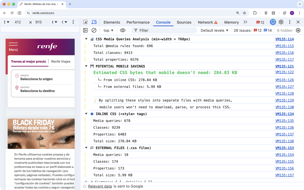
A Real Case: Analyzing Renfe
To illustrate the potential of this analysis in a real scenario, we ran the snippet on the Renfe website. In the screenshot, you can see that the “Potential mobile savings” exceeds 284 KB. This is a considerable amount that, if optimized, could significantly improve load times and user experience for those accessing from mobile devices.
Conclusion
Web performance is in the details. Optimizing our media queries is one of those details we often miss but that can make a big difference. With a simple JavaScript snippet, we’ve seen how we can get a clear view of how much CSS we’re wasting on mobile devices.
This analysis gives us the power to move from intuition to action, applying optimizations that have a measurable impact on our users’ experience. Because in the end, a faster site is a site that converts more and that users enjoy using more.