> This article is part of a series of articles dedicated to **Web Animation**.
- [Web Animation](/en/blog/web-animation/)
- [CSS Transitions](/en/blog/css-transitions/)
- **CSS Animations**
- _SVG Animations (Coming soon)_
- _JavaScript Animations (Coming soon)_
- _Canvas Animations (Coming soon)_
#### CSS Animation with @keyframes
In CSS, apart from being able to animate state changes with [CSS Transitions](/en/blog/css-transitions/), we have the `animate` property available which together with the at-rule `@keyframes` allows us to define an animation by controlling time, multiple states (keyframes), number of repetitions, animation direction and the timing function, to achieve a more natural animation.
Before going into detail, analyzing each of the properties and their values, let's look at an example of an animation.
### What can we animate on a website?
The `animation` property allows us to animate many CSS properties: color, position, margins, paddings, opacity or sizes. Both on [W3C](https://www.w3.org/), and on [MDN](https://developer.mozilla.org/) we'll find a table of property characteristics. One of those characteristics informs us of the [Animation Type](https://drafts.csswg.org/web-animations/#animation-type), which indicates the type of animation that property supports `not animatable`, `discrete`, `by computed value` or `repeatable list`.
In [this link](https://developer.mozilla.org/en-US/docs/Web/CSS/CSS_animated_properties) from MDN you'll find a list of CSS properties that can be animated. Or [this other one](https://parrot-tutorial.com/cssref/css_animatable.html) where there's also an example of each one.
### The animation property
There are several properties to define and configure an animation, as with many CSS properties, we can do it with a shortcut or by defining each one.
I think it's better to know the properties, and what they do, than to memorize the order of values... so let's see all the `animation-*` properties.
```css
.logo {
animation-name: logoAnimation;
animation-duration: 2s;
animation-timing-function: ease-in-out;
animation-delay: 1s;
animation-iteration-count: infinite;
animation-direction: normal;
animation-fill-mode: forwards;
animation-play-state: initial;
}
```
#### animation-name
With this property we define the name or names of the animation or animations we want to apply to the element, this name must match one of the `@keyframes` we have defined, but we'll see that in a bit.
#### animation-duration
Well, it's not difficult to guess that with this property we can define the duration of the animation or animations, we can do it by indicating it in seconds or milliseconds.
#### animation-timing-function
In my opinion, this is the most interesting animation property. It allows us to indicate a timing function that will be applied according to the animation duration. We have a few predefined functions, which will make our animations look more natural.
> I think this property deserves a dedicated article and video to see all its potential, so today we'll only see the most basic aspects.
It accepts "keyword" values and functions:
```css
/* Keyword values */
animation-timing-function: ease;
animation-timing-function: ease-in;
animation-timing-function: ease-out;
animation-timing-function: ease-in-out;
animation-timing-function: linear;
animation-timing-function: step-start;
animation-timing-function: step-end;
/* Function values */
animation-timing-function: cubic-bezier(0.1, 0.7, 1, 0.1);
animation-timing-function: steps(4, end);
```
The default value is `ease` and is represented like this:

The horizontal axis represents the animation time and the vertical represents the values being changed in the animation.
This way we achieve a smoother animation, instead of a linear animation. But be careful, a linear animation can make sense on some occasions, but we'll see that with examples in the specific chapter on **[CSS Easing Functions](https://www.w3.org/TR/css-easing-1/)**.
For now we'll stay with the fact that this property allows us to have control over how the animation timeline will be calculated.
#### animation-delay
Just as we have a property to define animation time, we can also define how much time must pass before the animation starts. We can also define time with seconds and milliseconds, yes, we can define a negative delay, which affects the animation timeline.
If we have a 2-second animation and define an `animation-delay: -1s` the animation will start executing immediately and will also start at second 1.

#### animation-iteration-count
With `animation-iteration-count` we can define the number of times the animation will execute, it accepts a positive number value or the keyword `infinite`, as in the example, this makes the animation execute infinitely.
#### animation-direction
This property allows us to indicate the animation direction, it accepts 4 values, let's see the definitions to better understand how this property can help us.
`normal`
Each time a cycle ends, the animation resets to the initial state and starts from the beginning. This is the default behavior.
`alternate`
The animation, when finishing a cycle, reverses its direction. That is, the animation steps are executed in reverse. Additionally, timing functions are also reversed; for example an ease-in animation becomes an ease-out animation when played in reverse.
`reverse`
Each animation cycle plays in reverse. Each time an animation cycle begins, it positions at the final state and starts from there.
`alternate-reverse`
It's similar to alternate but the animation plays in reverse. That is, the animation positions at the final state, starts playing in reverse and, when it reaches the beginning, plays normally again until reaching the end of the sequence.
#### animation-fill-mode
`animation-fill-mode` is the property that allows us to define the state after the animation, and also the state before the animation if there's a delay. By default it returns to its initial state, with the normal value.
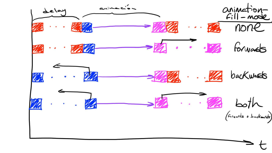
> Drawing by [Ángel Corral](https://twitter.com/ancoar)
Here we can see what happens if we apply a value of `forwards`.
Another interesting value of this property is `both`, it will work the same as `forwards` but will take into account the animation direction. Remember that with `animation-direction` we can make the animation reversed?, well this value will help us define the behavior we want in our animations.
#### animation-play-state
This property is also very interesting, as it allows us to provide interactivity to our animation from CSS, without using JavaScript. We'll see later how to work with animations in JavaScript, the animation API is great... well let's not get distracted 😊.
Available values are:
```css
/* Single animation */
animation-play-state: running;
animation-play-state: paused;
/* Global values */
animation-play-state: inherited;
animation-play-state: initial;
animation-play-state: unset;
```
The default value is `running`, and we can pause by changing its state. But let's see an example:
Surely you've seen that there's no animation, that's because I've defined an initial paused animation state `animation-play-state: paused;`, and with a hover on the `body` I change the animation state to `running`. Try putting the cursor, **sorry to people reading this from a mobile device** 😅, in the **Result** area. You'll see that the animation executes and pauses depending on whether you hover over the document body or not.
### Shorthands and default values
#### The animation shorthand
Generally when we see CSS code with an animation we'll see something like this:
```css
.logo {
animation: scale 2s infinite ease-in;
}
```
It's the abbreviated way of defining an animation. The specification defines an order for the parameters, to facilitate compatibility between browsers when implementing it.
```css
.logo {
animation: "animation-name" "animation-duration" "animation-timing-function"
"animation-delay" "animation-iteration-count" "animation-direction"
"animation-fill-mode";
}
```
I'm putting them one under the other to improve readability, but they're all defined on the same line without separating them with a comma. Although that's the order defined by the W3C, if the order is changed, browsers are smart enough to understand what each value refers to. One thing to keep in mind is `duration` and `delay`, if there's only one time value, the browser will interpret it as `duration` and if there are two, the first will be `duration` and the second will define `delay`.
#### Default values
In the examples we've been seeing, I've defined values for all properties for educational purposes, but we must keep in mind that the absence of any of these properties will be represented with their default value.
For example, there's no need to define `animation-timing-function: ease` or `animation-delay: 0s`, as they are the default values.
### The @keyframes
Until now we've seen all the properties of time, function, iterations, etc... to add animation to a class, but where do we create or define the animation?
This is where `@keyframes` come into play. As we saw in the [CSS Transitions](/en/blog/css-transitions/) article, with transitions we can make the browser interpolate between two states and thus achieve an animation. But when we want to have an animation with more than 2 states we have to use `@keyframes`.
Keyframes refer to animation frames, and we can define as many as we need, let's look at the code of the animation we've been using as an example.
```css
@keyframes logoAnimation {
0% {
opacity: 0;
transform: translateX(-100px);
}
20%,
80% {
opacity: 1;
transform: translateX(0);
}
100% {
opacity: 0;
transform: translateX(100px);
}
}
```
The first thing we see is that we're not defining a selector, but an [at-rule](https://developer.mozilla.org/en-US/docs/Web/CSS/At-rule) _(like @media, @support, @font-face, etc...)_, it's `@keyframe` followed by the name we want the animation to have. That name is the identifier we're using in the `animation-name` property. We continue with a block, as we also do in classes, but this time we don't define CSS properties, we define keyframe blocks where inside we'll write the CSS properties we want to animate... now is when the exciting part begins 😊.
To define keyframes, we have two ways of doing it, through keywords or with percentages.
```css
@keyframes {
[ [ from | to | ] [, from | to | ]* block ]*
}
```
`from` equals **0%** and `to` equals **100%**.
These two animations are equivalent, it's completely indifferent from the browser's point of view.
```css
@keyframes logoAnimation_keyworks {
from {
opacity: 0;
transform: translateX(-100px);
}
to {
opacity: 1;
transform: translateX(0px);
}
}
@keyframes logoAnimation_percentage {
0% {
opacity: 0;
transform: translateX(-100px);
}
100% {
opacity: 1;
transform: translateX(0px);
}
}
```
We can even mix keywords and percentages.
```css
@keyframes logoAnimation {
from {
opacity: 0;
transform: translateX(-100px);
}
20%,
80% {
opacity: 1;
transform: translateX(0);
}
to {
opacity: 0;
transform: translateX(100px);
}
}
```
### Multiple animations
Just like transitions, animations support defining multiple animations. This gives us greater control if we want to make a sequential animation.
In this example I've created a sequence of 4 animations.
```css
.logo {
animation: fadeIn 1s ease-in forwards, growth 1s 1s ease-in forwards,
fadeOut 1s 2s ease-out forwards, logoAnimation 500ms 3s ease-in forwards;
}
```
 We control the animation sequence with the `animation-delay` property, adding the time of previous animations.
> This is very artisanal work and not scalable at all, but we'll see that when we work with animations in JavaScript.
## Conclusion
So far we've seen the basics of CSS animation, in implementation we'll find some cases where we need to know well the possibilities of CSS properties. In future chapters we'll see implementation examples, debugging, optimization and best practices.
We control the animation sequence with the `animation-delay` property, adding the time of previous animations.
> This is very artisanal work and not scalable at all, but we'll see that when we work with animations in JavaScript.
## Conclusion
So far we've seen the basics of CSS animation, in implementation we'll find some cases where we need to know well the possibilities of CSS properties. In future chapters we'll see implementation examples, debugging, optimization and best practices.